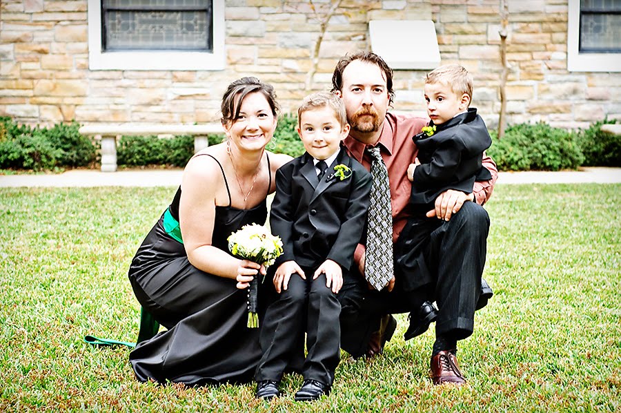
This week, i heart faces is doing something a little bit different. Instead of the normal Fix-It Friday, we are to post a picture on which we would like to have constructive criticism. I had a hard time narrowing it down to just one. I could definitely use as much critiquing as humanly possible.
I decided to post the following photo because I was trying some new framing techniques. I don’t know what it is about this photo that I don’t like…but there is definitely something; which I find completely disappointing because it had every opportunity of turning out cute.
Can’t wait to hear what you all have to say. Thanks so much for your time and input.


18 comments:
Woman, you're insane. That is a BEAUTIFUL photo! I absolutely love it...I think it's one of my favorites. Did you take it in CO?
No, it was taken here in Red Rock Canyon park. Thanks for the compliment!
there's nothing bad about the photo that is bad, its cute, perfectly framed...
My first impression was very good. The skin tones are nice, the color and lighting nice.
I think the main room for improvement here is framing. Two types of cropping would improve this photo, putting more into the frame, or cropping much tighter.
For the (next) long shot, a little more ground and the top of that opening being included would help. the sides are chopped off strangely too. Sometimes taking a longer shot then cropping to perfection later works the best. so start back a little further than necessary and crop closer with the perfect balance later. This is a good reason to use full resolution when you're shooting, you have more room to crop without quality loss.
**It's VERY hard to capture a child this age just right in a frame!
When you capture a priceless shot of your child go ahead and do a really nice close crop and focus on the child.
(I just handed my D80 down to my husband and have a D90 now. How long have you had yours?)
Oh my gosh, I love my precious little nephew! So, so, so cute!
This would look so good if it was a horizontal shot. Try cropping the top off closer to his head. Then the focus is on the subject, not the background. I'm always super picky about my backgrounds and would probably Photoshop that black thing out right behind him. Would clone in more of the green tree there. I would only spend time on that if I was going to frame the shot for my home.
This is a really great photo of him!! I love the warm colors. So cute:-)
Amy
Co-Founder
I Heart Faces
I think it is adorable. I love the backlighting. I agree with Amy on trying a horizontal crop, though I wouldn't have thought of it if she didn't first! I want in on this carnival. I'm heading over to i Heart faces now!
I'm with everyone else on this. The photo is beautiful. I'm thinking a different crop will make it feel "right" to you. It's definitely a keeper!
I agree with everyone on the framing of the picture, but like someone else stated its very hard to capture a little one just right. My rule is I always stay as far back as I can with my 300 lens then I zoom in and out. I would just crop to my liking, and I would also adjust the lighting/shadows on the right side of the rocks.
First of all, this photo is beautiful! But, I would adjust some of the shadows and highlights a little, take out that black thing behind your son as it's a little distracting and maybe sharpen it a little more to bring out the texture of the rocks/bricks. I love the pop of color on your son's pants. Great job!
GREAT photo! ADORABLE little one!
The framing doesn't even bother me...it's something with his eyes/face that's throwing me off....I'm not sure if his eyes are too sharpened or his face is too soft....I don't know, has kind of a doll-like feel to it.
Do you soften skin? Maybe that's what is causing that effect. When I first got my powder action, I was SO guilty of just softening all the faces WAY too much and they ended up looking fake and mannequin like. OOPS! HAHAHAHA I am learning to back off on that a bit.
I always LOVE seeing your pictures!
I think this is perfect... I'm obviously not a professional, but I do love photography and from my un-schooled eye.... it's just wonderful. The framing from the rock structure is divine and the colors are sharp and clear. If I had to adjust one thing, I might crop it more, but seriously it's perfect!
I think that I'm in agreement with momof3darlings...the skin does seem just a bit too soft and "perfect." If you toned down the skin smoothing just a tad, I think it'd make your little guy look more realistic. All of the other suggestions are fantastic as well.
You are doing so well with your photography Melinda!
~Angie
co-founder of I ♥ Faces
It has obviously been too long since I've been to Red Rock!!! DUH! The RED ROCK might have been a clue ;)
I like it. I like all the variations in nature's textures that it shows. Plus he's squeakin' cute!
I am so impressed. Great photo.
Plus, look at that face!
I've got the D60 myself. But I don't have cute children around to photograph without the cops being called, so you've got that going for you.
I really liked the picture. It just goes to show....I don't know a thing about face light or softness or anything else. You are a great photographer and even more important than that- an amazing mother : ).
Post a Comment