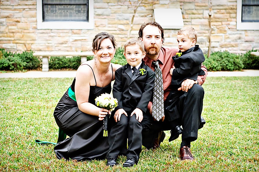
It has been a while since I participated in i heart faces’ Fix-It Friday, but I just couldn’t resist this week’s challenge.
Sticking with the “We are Family” theme from this week, Angie and Amy decided to highlight a very special family. Although I don’t follow this woman’s blog personally, I do follow Angie’s blog and she often talks of the trials this family is going through.
“The dad in this family has been struggling with cancer for years and they found out the devastating news in December that his cancer is now terminal. They are now doing everything they can to enjoy the rest of the time they have together on this earth.”
Having lost a grandmother to cancer myself, I know how devastatingly hard dealing with this disease can be. I hope you will join Angie, Amy, myself, and the rest of the blogging community in praying for this family’s continued strength and perseverance in the time ahead of them.
On that note, here is my submission for this week’s Fix-It Friday:
To get to this point, here are the steps I took using PSCS4:
- First off, I cropped and rotated the image.
- I duplicated the layer to make some color adjustments.
- Go up to image – adjustment – levels – RGB – move left slider to 23, right slider to 240 and middle slider to 85
- Go up to image – adjustments – levels – Blue – middle slider to 90
- Go up to image – adjustments – Hue/Saturation – Reds saturation to –7
- Vibrance +2, Saturation +1
3. Flatten Image
4. Next, I used the doge tool to rid the kid’s faces of some shadows. I used a soft brush with the opacity set at 6% and ran it over mostly the eyes first with the midtones selected and the the shadows selected.
5. Ran Boutwell magic glasses at 40%**
6. Ran Slice like a ninja at 15%**
7. Next I added two different textures. I wish I could tell you where I got them, but I have no idea. When I find something I like, I simply save it into a designated folder on my desk top. Since I don’t want to infringe on anyone’s copyright legalities, I won’t share them here. Sorry.
- The first texture I chose to run as a “Soft light” with the opacity set at 55%
- I then added a layer mask and using a soft brush with the opacity set at 100% and the flow at 41%, I ran it over the skin of the 3 kiddos.
- Next, with a soft brush set at 35% opacity, flow still set at 41%, I ran it over the clothes just a little bit
- Then I added the second texture but decided to use this one as an overlay with the opacity at 28%
- Again, I added a layer mask and using the same brushes as before I repeated the same steps with the skin and clothes.
8. Flatten Image.
9. I felt the image was a little dark so I ran TRA’s Clarify at 15%
My Fix #2:I wanted to go for a little more drama, so I created one more fix-it by running TRA’s Bit%$& Black and White at 100%, but I opened it up and lowered the curves to 70%. I then ran TRA’s Boring Selenium at 50%, Antique Tone at 50%, flattened the image. Then used a burn tool set at 15% for around the corners.

** – these actions are free at Totally Rad Actions


9 comments:
I really like the purity of your tones, thanks for the step-by step!
Beautiful! I love the color edit best. Simply lovely!
Very nice! I like the angle of the crop and your step-by-step instructions are great... I don't have the patience to write it all down, I just start fooling with it till I'm happy! lol!
Great edits. Your crop is similar to mine - but better! :D
Your fixes are just absolutely beautiful Melinda. And the crop? Fantastic!
Thank you so much for taking the time to share Adrienne's story. They can use all the kind thoughts and prayers people can throw at them right now.
Love the pictures. The tutorial is a little over my head, but I shared it with my hubby!
Keeping your blogging friend, Adrienne and her family in my prayers....
~ Jennifer
http://thetoyboxyears.blogspot.com
Nicely done! I like the coloring and angles.
Love the angle and the processing...great job *insert tony the tiger voice on the word great*
LOVE it!!!!! the angle makes it an awesome picture!!!!!
Post a Comment